publicis toronto rebrand
In 1926, Marcel Bleustein-Blanchet etched a few bold shapes into a door in France. It was the beginning of something that would change advertising forever. Over a century later, those very forms have inspired a new chapter of change, now crafted not by one, but by the many hands that carry Marcel’s legacy forward.
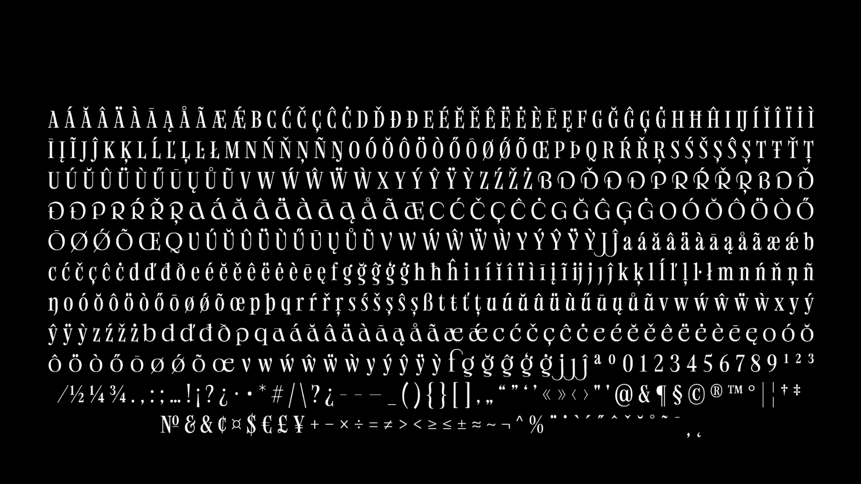
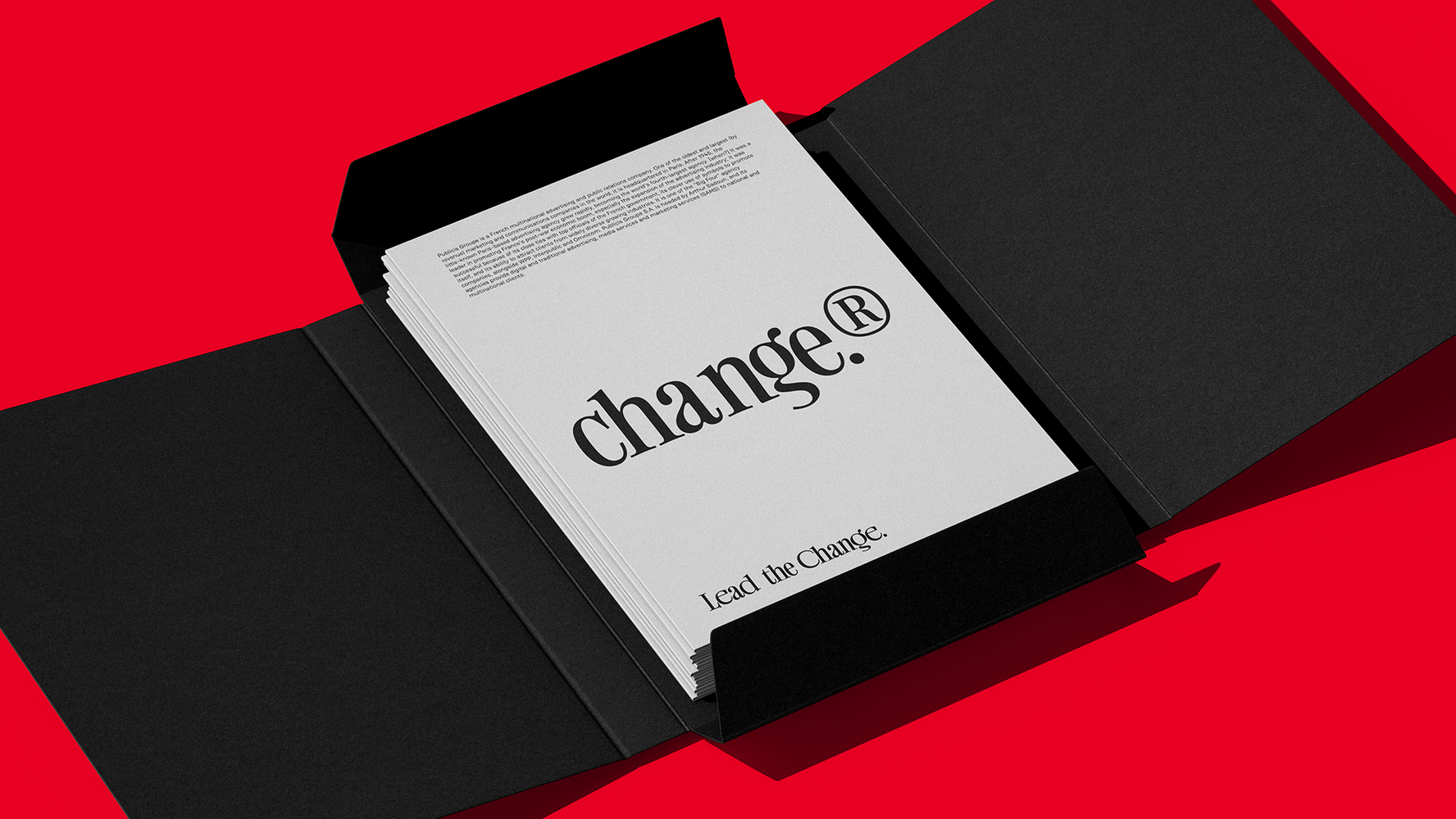
We reimagined typography, rooting it in the geometry of our logo. Every typeface has a glyph version. Because change means going against the norm. A full alphabet, Designed to create change.